You're The One That I Font: Pairing Fonts Together
In this post, you’ll learn the ins and out of how to select the right font combinations for your branding. In our last post in the All Up In Your (Type)Face series, we discussed the different classifications of fonts and their characteristics. Now you may be wondering, how do I know what fonts go well together? Pairing fonts together is all about striking the right balance, establishing a clear hierarchy, and knowing and following a few general rules.
Get to Know the Font Personalities
First and foremost you want to consider your context. Each font comes with its own personality so it’s key to be able to recognize when and how to utilize certain font personalities that complement one another in your branding. Clean, easy-to-read fonts should be used for long passages of text, while fonts with more personality, such as a script type, can be used as your headline font or even the font in your logo.
Alternatively, if the look you are going for is a retro-vibe, you can choose a font that has some 70’s flair like these. If you want to express an established and old-school feeling, stick to a classic serif font. Use the Google to your advantage here; do a little research on the fonts you like and see when they were created and for what purpose. By understanding the origination of the fonts, you’ll have a better idea of what kind of personality have. Spend some time exploring about various fonts; you’ll start to get the hang of it with practice!
Create a Visual Hierarchy
When you’re getting started making decisions about which typefaces to pair together, consider the final product you’re creating and its intended use or purpose. All good design establishes a visual hierarchy and creates an easy way for the viewer to flow through it. Think of a newspaper or magazine layout. Typically, you always know what to read first; there’s a clear title, a subtitle, and an article. Apply this principle to anything you design. Choose what you want the reader to see and read first, then use the font with the most personality as a header to catch the reader’s eye. This header font should be the largest font as well. Do you want the reader to see your special offer first or the title of your article? Or your company name? Whatever it is, make that piece the largest and most pronounced element. Then, use a complementary font for your subtitle, and an easy to read font for any long passages of text. As a general rule of thumb, you should stick to no more than three fonts in any given piece of designed work. Using too many fonts creates busyness, and the viewer won’t know where they are supposed to look next, which makes them lose interest faster. If you can’t decide what’s best, I always like to stick to the old acronym created by the US Navy in the 1960s, K.I.S.S., (keep it simple, stupid).
Notice how the headline (Toronto Fashion Week) grabs your attention, then you read the subtitle below, and follow along to the article text after that.
Mix Serifs and Sans-Serifs
If you’re feeling really stuck when trying to choose fonts, try mixing serifs and sans-serif fonts together. These two contrasting fonts typically go well together, and it’s pretty simple to put two together that are complementary. San-serifs are generally considered to be more modern, while serifs are more classic and traditional. Determine what feel is best for your needs, and choose your fonts accordingly.
Use fonts from the same family
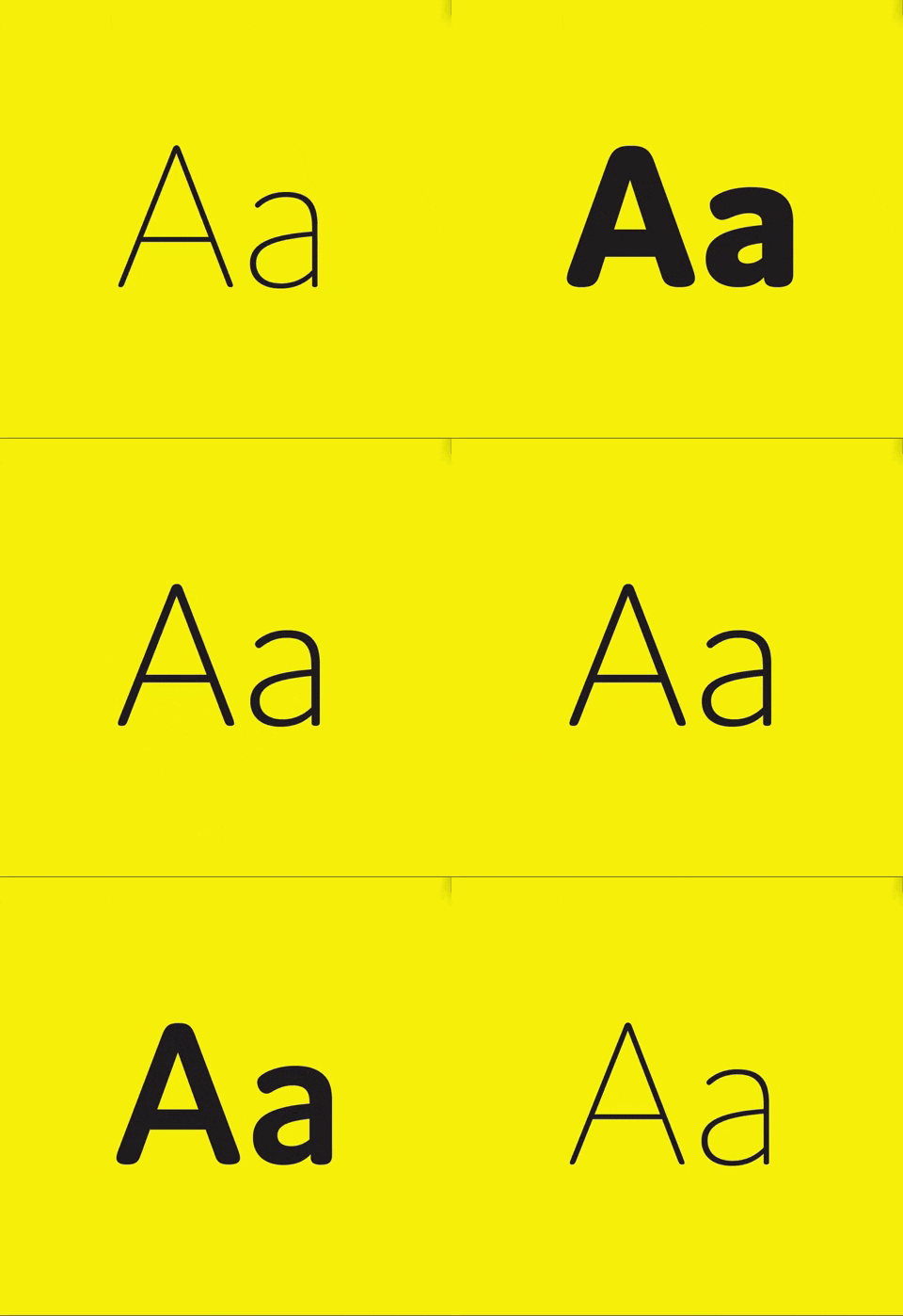
Another quick and easy way to pair fonts together is to stick to only using one single font. Fonts within the same family innately have similar characteristics so by using contrasting weights and styles from the same typeface you can ensure that they complement one another. By weight, we simply mean bold, semibold, medium, light, ultralight, etc., and by style, we mean italic, small caps, all caps, etc. Use a bold, all caps style paired with a lighter weight to create a nice contrast.
Image source: https://www.fontshop.com/content/posterama
Create a Balance
In design, it’s typically thought that less is more. When pairing fonts, you want to strike a nice balance. Putting all the above rules into action will help you achieve that look. Remember that opposites attract, but that you still want some common thread to tie it all together. Don’t use fonts that are total opposites. For example, a really tall, condensed font wouldn’t pair well with a round, ornamental font. Use a handwritten font with a serif font, or a display font with a sans serif font. Don’t ever pair two script fonts together, or two handwritten fonts together. Try to strike that balance where you have a nice contrast, but that the typefaces have a similar personality and tone.
It can be really daunting to learn the ins and outs of what typefaces work well together. I’d encourage you to start taking notice of all the typography around you in your day to day life. People often like to poke fun at designers and say that they are always critiquing the design around them, like menus at restaurants (it’s definitely true!). If you start doing the same and noticing how fonts are paired together on design elements that you are drawn to, you can start taking that as inspiration and apply it to your own work. Practice makes perfect!
We hope that this blog post helps you feel more confident as you start to pair fonts together in your branding and marketing materials.
Do you have questions or comments about the content above? If so, share your thoughts in the comment field that you can find below.


