Choosing a Color Palette for Your Brand
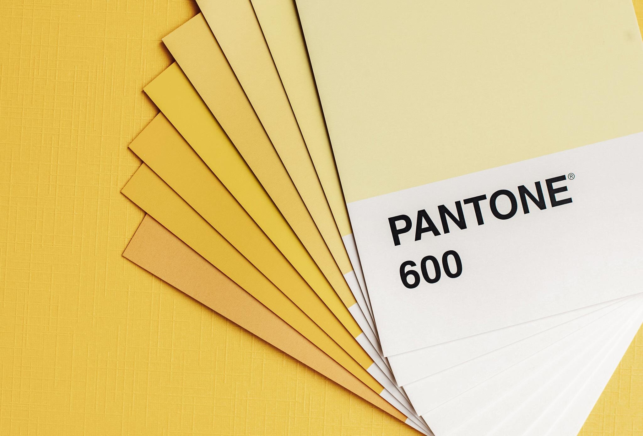
Everyone loves a good color scheme. I even have a Pinterest board solely dedicated to color schemes. A well-curated color scheme brings a desired emotion to the viewer almost instantaneously. As a brand designer, I cannot emphasize enough how important it is to choose the right colors for your brand, but there’s also a psychology behind each color that you’ll want to consider. I wrote about color psychology earlier this week, which you can read more about in this blog post. You’ll want to pick colors that will convey the intended emotion to your audience; essentially, you’ll want to select colors that evoke the look and the feel of your brand.
So, today on the blog, I’ve decided to explain best practices when choosing a color scheme.
No matter what stage you are at in the branding process, you need to have a color associated with your brand. It’s how you create and maintain brand recognition. Did you know that color increases brand recognition by up to 80%. To choose a color scheme, first, determine the feelings you want your brand to convey. If you need help with this step, check out our branding tip sheet for guidance on how to determine your branding vision and values. Second, create your Pinterest moodboard (Check out our blog post on creating a moodboard here). Third, choose 1-3 dominant colors based on the moodboard you’ve created, and the words you’ve decided you want your brand to convey. Lastly, check out the post I mentioned above on the psychology behind colors and make sure you are using the right colors to convey the right feelings and emotions.
As a general rule of thumb, I would stick to no more than 5-6 colors for your color scheme. Once you’ve chosen your 1-3 dominant colors, you’ll need to pick 1-3 additional colors to use elsewhere in your branding materials.
You’ll want to have:
At least one dark color
You can use it for text and accents, or as a background with light text overlaid on top
1-2 Light Colors
These can be used for accents and backgrounds and are light enough that text can be written on them and still be readable.
1 Main, Bold Color
This “dominant color” is the main color of your color scheme and the one you should choose first, and feel that it, in comparison to the other colors, represents your brand look and feel the most.
1 Neutral Color
This could be white, light gray, beige, or anything that ties the color scheme together and keeps it grounded.
1 Contrasting Color
This color can be used for accents to help make certain elements of your logo (branding materials?) stand out.
Bonus Tip: Pinterest has an unlimited source of wonderful color schemes for inspiration. Simply search an adjective + “color scheme” (i.e. happy color scheme) and see what comes up! Alternatively, if you already know your dominant color, search that + color scheme.
If you are an Adobe Creative member, you can use Adobe Color. This is one of my favorite programs for choosing colors schemes. You can select the main colors you want to use and the program will automatically create a curated color scheme for you. You can search through different ones until you find one you like, and you can save it with all the CMYK/RGB/Hex or PMS codes to reference later.
I hope this helps you with choosing colors for your brand. As always, if you feel stuck in your branding, or need help defining your brand, feel free to reach out to us anytime!

